


Websitetology Facelift: 2015 Edition
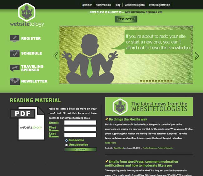
2010 design: Throwback Thursday material
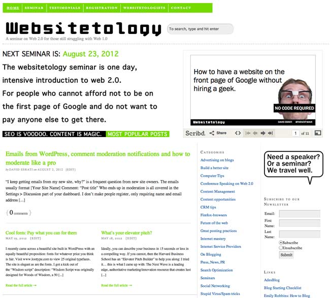
If you’ve been following us a while, you might remember our post all the way back in 2012, where we unveiled our newest, shiny design to bring us into the twenty-teens. The adage about cobblers and shoes we used then once again started ringing true in 2015. We’ve always been in the loop about what makes a great website, even from a design standpoint, but usually those things were reserved to our clients over at The Next Wave and spreading the word to our seminar attendees.
So much has changed even in the three years since our previous design. The biggest of which is the rise of responsive web design, which allows a website to adapt to whatever device a user is viewing the website so that it never looks wrong. With this technology comes a “mobile-first” approach to design, in which websites are designed with mobile devices in mind, then scaled up and enhanced for laptops and desktops.

Google pays its respects to Websitetology 2015.
With Google’s mandate that sites be mobile friendly or face consequences in the search engine rankings, we knew we couldn’t wait around any longer to give our site a new facelift. So if you’re reading this post on our website, you’re looking at the new Websitetology design.
Maybe the space aesthetic isn’t your thing. That’s cool. The great thing about the way this site was designed and coded is that the thematic images throughout the site, including the slides on the homepage, can be easily swapped out for new ones without altering a single bit of code. We can return to Earth and give the site a fresh look at a moments notice.
So what do you think? Love it? Have any constructive criticism? Leave your comments below.