


2010 design: Throwback Thursday material
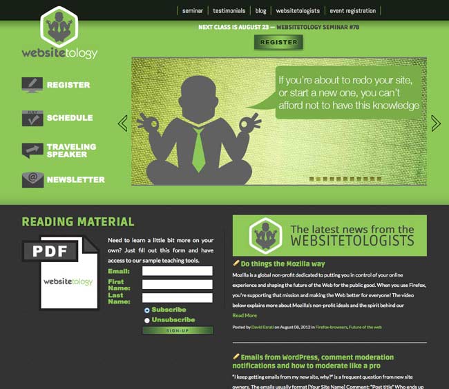
If you’ve been following us a while, you might remember our post all the way back in 2012, where we unveiled our newest, shiny design to bring us into the twenty-teens. The adage about cobblers and shoes we used then once again started ringing true in 2015. We’ve always been in the loop about what makes a great website, even from a design standpoint, but usually those things were reserved to our clients over at The Next Wave and spreading the word to our seminar attendees.
So much has changed even in the three years since our previous design. The biggest of which is the rise of responsive web design, which allows a website to adapt to whatever device a user is viewing the website so that it never looks wrong. With this technology comes a “mobile-first” approach to design, in which websites are designed with mobile devices in mind, then scaled up and enhanced for laptops and desktops.

Google pays its respects to Websitetology 2015.
With Google’s mandate that sites be mobile friendly or face consequences in the search engine rankings, we knew we couldn’t wait around any longer to give our site a new facelift. So if you’re reading this post on our website, you’re looking at the new Websitetology design.
Maybe the space aesthetic isn’t your thing. That’s cool. The great thing about the way this site was designed and coded is that the thematic images throughout the site, including the slides on the homepage, can be easily swapped out for new ones without altering a single bit of code. We can return to Earth and give the site a fresh look at a moments notice.
So what do you think? Love it? Have any constructive criticism? Leave your comments below.
You know the millions of dollars Rupert Murdoch spent designing “The Daily” for iPad- and Conde Naste and all the other publishers? Yeah, well a free plugin for your wordpress install makes your site sexy like a magazine app- with a quick click of the install button: either go to your plugins and search for it- or go to the addon page Onswipe
It’s been rolled out to all the wordpress.com sites- and is supported by Automattic– the people who manage the WordPress project. From their blog:
With the launch of Apple’s iPad we have seen the future of computing and it is touch. Nothing matches the visceral feel of navigating your digital world with your hands. The past four months we’ve been working closely with Onswipe to bring your iPad visitors our vision of what a blog can look like re-imagined for a touch experience.
Our iPad-optimized view is app-like in its functionality, but pure HTML5 goodness on the backend: it supports touch interactions, swiping, rotation, and many other features of the iPad….
There are some fun options to play with too. If you browse to Appearance -> iPad in your Dashboard you can:
- Have the theme use an image from your recent posts as a cover.
- Upload a logo to showcase your brand or personality on the cover.
- Upload an image to be used as a loading graphic when visitors add your site to their home screen.
- Switch fonts.
- Choose from 9 different skin colors, to best match the feel of your site.
- Enable or disable the whole thing.
When you tap to view a post, you get to see the full content with a slick commenting interface and social sharing tools for Twitter, Facebook, and WordPress.com literally at your finger tips. It’s a lot of fun browsing sites with Onswipe.
On WordPress.com we’re seeing about 750,000 page views a day from iPad visitors and it continues to rise. New tablet devices seem to be coming out every time you turn around. In the coming months we’ll be expanding to work with other popular tablet devices, but we chose to focus on the iPad first because… well it’s cool.
The beauty of the perfect implementation of good code that separates the content from the presentation- as WordPress does so well, is it is easy to reformat your content multiple ways- and for multiple devices (the exact opposite of sites built in Flash). Due to the huge installed base of WordPress sites- the developments and goodness come all that much quicker than they do for other open source CMS systems- and blow the doors off proprietary code bases.
I’ve installed it on www.esrati.com for a test – so if you have an iPad, go check it out. Of course, if you don’t have an iPad, you won’t get the dreamy effect.
This is just one more reason- that looks of your site- aren’t as much of an issue as content. So get busy- install it- and write some new posts.