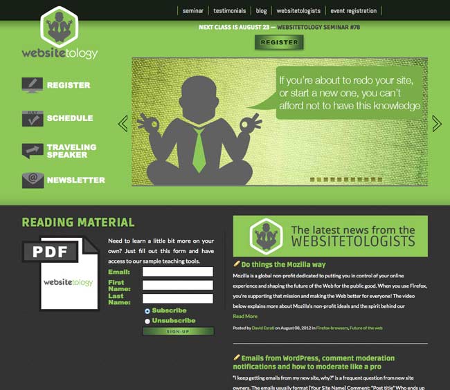
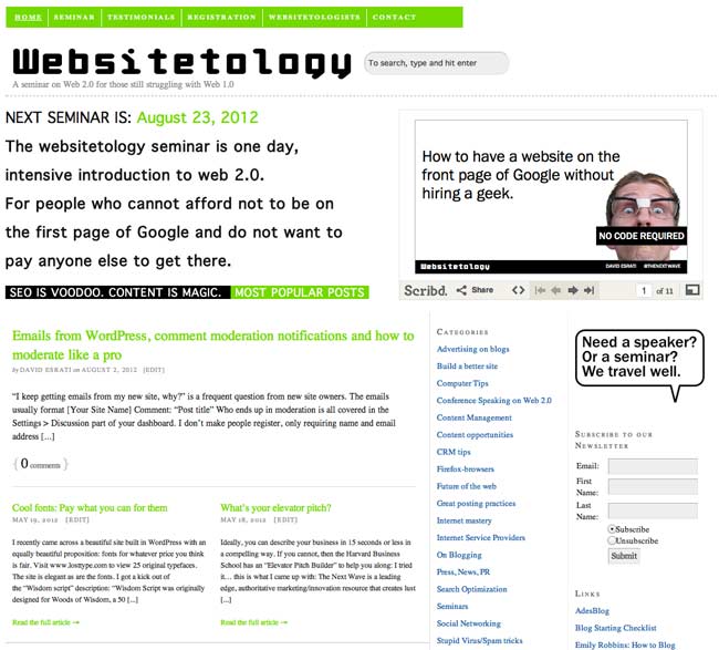
There is an old saying about the cobblers kids having the worst shoes. We have felt kind of guilty about our site and finally got around to giving it a facelift.
We’re still working on some details, including our CRM integration and a few other cool tricks, but here is the before:
The new site, incorporates the new identity, a much more focused front page, with calls to action. We’re still working on adding functionality. Note, the content hasn’t changed- just the way it’s displayed- this is the beauty of WordPress:
We’d love to hear what you think of the new design in the comments.
You know the millions of dollars Rupert Murdoch spent designing “The Daily” for iPad- and Conde Naste and all the other publishers? Yeah, well a free plugin for your wordpress install makes your site sexy like a magazine app- with a quick click of the install button: either go to your plugins and search for it- or go to the addon page Onswipe
It’s been rolled out to all the wordpress.com sites- and is supported by Automattic– the people who manage the WordPress project. From their blog:
With the launch of Apple’s iPad we have seen the future of computing and it is touch. Nothing matches the visceral feel of navigating your digital world with your hands. The past four months we’ve been working closely with Onswipe to bring your iPad visitors our vision of what a blog can look like re-imagined for a touch experience.
Our iPad-optimized view is app-like in its functionality, but pure HTML5 goodness on the backend: it supports touch interactions, swiping, rotation, and many other features of the iPad….
There are some fun options to play with too. If you browse to Appearance -> iPad in your Dashboard you can:
- Have the theme use an image from your recent posts as a cover.
- Upload a logo to showcase your brand or personality on the cover.
- Upload an image to be used as a loading graphic when visitors add your site to their home screen.
- Switch fonts.
- Choose from 9 different skin colors, to best match the feel of your site.
- Enable or disable the whole thing.
When you tap to view a post, you get to see the full content with a slick commenting interface and social sharing tools for Twitter, Facebook, and WordPress.com literally at your finger tips. It’s a lot of fun browsing sites with Onswipe.
On WordPress.com we’re seeing about 750,000 page views a day from iPad visitors and it continues to rise. New tablet devices seem to be coming out every time you turn around. In the coming months we’ll be expanding to work with other popular tablet devices, but we chose to focus on the iPad first because… well it’s cool.
The beauty of the perfect implementation of good code that separates the content from the presentation- as WordPress does so well, is it is easy to reformat your content multiple ways- and for multiple devices (the exact opposite of sites built in Flash). Due to the huge installed base of WordPress sites- the developments and goodness come all that much quicker than they do for other open source CMS systems- and blow the doors off proprietary code bases.
I’ve installed it on www.esrati.com for a test – so if you have an iPad, go check it out. Of course, if you don’t have an iPad, you won’t get the dreamy effect.
This is just one more reason- that looks of your site- aren’t as much of an issue as content. So get busy- install it- and write some new posts.
“But, I don’t want to have a blog for a website”- we hear it all the time. The reality is, WordPress is a Content Publishing system using a database. It really doesn’t care what your site looks like, it’s just the tool to manage that content.
I don’t call it a Content Management System anymore- because, it’s really not managing the content, you are. It helps you publish to the web what you need to publish, in the easiest way possible. We use other CMS systems like Drupal and Joomla- however, they require a steeper learning curve than WordPress- making them less likely to help you be prolific. Google prefers prolific – trust me.
We found the Thesis theme about 6 months ago. It’s a paid theme- something we typically don’t strongly recommend, however, from a developers standpoint, Thesis gives us all the tools we need to make a site do almost anything. For us, that’s worth it.
For you- it means you can have a site that looks great, and doesn’t look like a “WordPress” site. The developer of Thesis-Â Chris Pearson, is an active member of the WordPress community. He understands the idea of supporting his theme, and has been building a community of users. He’s on Twitter- Personified
Which brings us to the site that doesn’t look like WordPress (and there are many of them) that I thought I’d highlight today- Krispy Kreme UK. Take a look at the screen shot- or wander over to the site.
And, if you don’t want to pay for Thesis, there are some other premium type themes that are free. Read this post to see what’s out there.


