If you use WordPress to manage your content online, you’re smart and far from alone. Stats say that somewhere around 28% of the web we use is running on WordPress right now. The thing is, many of you have no idea you are looking at it when a master developer builds a site.
The secret sauce of WordPress is that the content, the stuff that brings visitors to your site, is in a database and separate from the presentation- the theme, the way it all displays. This is what makes things super easy to manage and maintain, and to format the output for any size screen and device. The part that makes Google search such a big fan is that the content is organized nicely using the four main tools: Posts, Pages, Categories and Tags. If you’ve taken our Websitetology seminar, you fully understand why most of your site should be using posts- in really well organized and thought out categories. If you haven’t taken our seminar- you should sign up.
However, there are a few big changes coming on the horizon to the World of WordPress- both from the top, the people who built and maintain this open source tour de force- Automattic (named for Matt Mullenweg, the guy who proved you can get rich giving something away that you don’t own).
First up is the subscription service JetPack, which builds upon a suite of plugin tools that were and still are free- but always required a wordpress.com account to tie you back to the “mothership.” In that form- JetPack did some cool stuff-
Keep any WordPress site secure, increase traffic, and engage your readers.
Traffic and SEO Tools
Traffic is the lifeblood of any website. Jetpack includes:
- [free] Site stats and analytics
- [free] Automatic sharing on Facebook, Twitter, LinkedIn, Tumblr, Reddit, and WhatsApp
- [free] Related posts
- [paid] Search engine optimization tools for Google, Bing, Twitter, Facebook, and WordPress.com
- [paid] Advertising program that includes the best of AdSense, Facebook Ads, AOL, Amazon, Google AdX, and Yahoo
Security and Backup Services
Stop worrying about data loss, downtime, and hacking. Jetpack provides:
- [free] Brute force attack protection
- [free] Downtime and uptime monitoring
- [free] Secured logins and two-factor authentication
- [paid] Malware scanning, code scanning, and threat resolution
- [paid] Site backups, restores, and migrations
Content Creation
Add rich, beautifully-presented media — no graphic design expertise necessary:
- [free] A high-speed CDN for your images
- [free] Carousels, slideshows, and tiled galleries
- [free] Simple embeds from YouTube, Google Documents, Spotify and more
- [free] Sidebar customization including Facebook, Twitter, and RSS feeds
- [free] Extra sidebar widgets including blog stats, calendar, and author widgets
- [paid] High-speed, ad-free, and high-definition video hosting
Discussion and Community
Create a connection with your readers and keep them coming back to your site with:
- [free] Email subscriptions
- [free] Comment login with Facebook, Twitter, and Google
- [free] Fully-customizable contact forms
- [free] Infinite scroll for your posts
So, you say- there are only a few pieces that are paid- I’ll jump in. However, that’s the beginning down the slippery slope to letting someone else control how your site works and see everything you do. We’ve avoided it for years- instead using tools from third parties.
The newest release of Jetpack gets its own site- Jetpack.com and looking at the business side (since we do WordPress for business as our bread and butter) you start seeing that it’s almost as if you are buying hosting from Automattic too- which isn’t a bad thing, until things go wrong in a big way, and the support just can’t deal with their scale. Automattic has been doing their VIP hosting for a long time, so they probably are pretty solid at this now, but, we’re still a little wary, and frankly, the price is pretty steep. You don’t need access to hundreds of premium themes- you just need one good one.
No matter what, the push into hosting smaller business sites and offering their own sets of tools, could be seen as direct competition with the entire ecosystem that has been built around WordPress. One of the key reasons WordPress has been so successful is the thousands of businesses that have been built on the platform- from theme and plugin developers to hosting firms and web developers.
And, as if that isn’t enough… here comes “Guttenberg”
What? Moveable type presses? Nope, a new way of editing text outside the standard text block editor that is the default. In other words, a builder- much like many of the builders that come with premium themes. There are plenty out there- we’ve gravitated to using Divi from Elegant Themes– which is both plugin and visual site builder/theme- but there are plenty of others.
What does the coming of Guttenberg mean for some of us? We’re not entirely sure. The Customizer was the first Automattic attempt to provide an interim WYSWIG interface to WordPress- and it didn’t change anything. What we are seeing is Automattic reacting to competition like SquareSpace/WIX/Weebly – all of which are WordPress with training wheels for those who can’t be bothered with doing a website right.
Guttenberg is still in beta and not ready for prime time. We’re waiting to see if it is in WP 4.9 or part of the major 5.0 release. In the meantime, you should be aware of the impending changes.
Back in January of 2012 we posted one of our most popular tutorials- how to make a JPG preview of a PDF document uploaded to your WordPress site.
It was a multi-step process. It was a pain.
There were plenty of reasons to upload a PDF- but, all WordPress would provide was a link. People want to see what they are clicking on to download.
There are many reasons why you would want to do this. First and foremost, uploading PDFs using the basic WordPress uploader just provides a link to the document- without a way for your user to see what the PDF looks like.
The reason you are using PDF’s instead of a JPG is because PDFs, if created properly, are search engine friendly and handicap accessible. To make a PDF properly, it’s not made from a scan- it’s made from an document-so that you can highlight and copy text from the PDF. If you are making a PDF from a scan, make sure you use the “recognize text” function to perform Optical Character Recognition on your scan. It won’t be perfect, but it will be close.JPG’s are not search engine friendly, whereas PDFs are.
Source: Websitetology – How To Make Thumbnails for PDFs
Since WordPress 4.7 or so, the media library will show a preview of a pdf you upload, but it still only places a link.
Lucky for us,
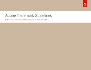
Just download, install and activate PDF Image Generator from the WordPress Plugin Repository and bam! Instant previews of every new PDF you upload. One thing, even though the library interface gives you the ability to specify justification, it doesn’t work. After the PDF image is in your editor window- click on the image and get the edit option- and pick your preference. The above Guidelines is right justified.
Note, your server must have ImageMagick and GhostScript installed or it won’t work (ask your hosting company- or host with us- www.nextwavehosting.net).
We’ve found this plugin to be invaluable, especially handy for manufacturers, news sites or government organizations that need to post a lot of PDF documents to share.
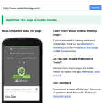
In one of our most recent email newsletters, we pointed readers to Google’s Mobile-Friendly Test so that people could check to make sure their sites weren’t being penalized. This link was far and away the hottest item in the email, with over 400% more clicks than any other link in the newsletter.
In spite of Google’s attempts at emphasizing the importance of mobile-friendly design, and later on their tough-love warnings that your sites will be punished after April 21st, the message seems clear to us: people, businesses, and their websites are being left behind and many are unsure what to do to catch up.
Some may breathe a sigh of relief upon receiving a passing mark from the test, but what if you’re left with a big, fat F?
Over at our agency, The Next Wave, we commonly receive requests to “add responsiveness to our existing site.” We understand that this kind of request comes from a good place: folks who are looking for an inexpensive and painless way into the mobile-friendly realm by “adding on” the mobile functionality.
The problem is that this is actually pretty difficult, in some cases impossible, to achieve from a designer and developer’s perspective.
Mobile-friendly designers will typically start designing a website by how it looks like on mobile devices, then expanding and scaling the design outwardly from there. The idea is that everyone will be looking at essentially the same website, and there is no inferior way to browse.
Mobile-friendly developers mostly code websites as a giant grid to complement this aforementioned approach to design. For instance, each item on a typical WordPress site: posts, sliders, headlines, forms, and etc. are placed inside various squares of a grid. This makes it very easy to scale websites. As the screen becomes larger and smaller, you can shift the grid around so that everything still fits, but the code itself stays the same underneath.
Most developers who are giving an old site true responsiveness are essentially coding a new site from scratch but still wrapping it up in your design that looked good back in 2010. It makes more sense to just go back to the drawing board and start fresh.
By now I can feel your frustration coming through. You’re likely thinking, “This is all well-and-good, but I still can’t afford the time/money to invest in a brand new website right now.” You might even be thinking that there’s nothing wrong with your site as it is, except for Google’s stupid new rule.
If you’re a WordPress user, there are a few plugins out there that can take your pages, posts, etc. and wrap it in a separate mobile site. Notably WPTouch—with a couple free themes—and the mobile theme feature in Jetpack. Desktop users will still see your same-old site, and mobile users will be served up something different.
Keep in mind, however, that your mobile users will be looking at an inferior version of your site that might not work very well. Eventually, you’ll have to move on.
It’s not as intimidating as it seems, we promise. In fact, you could do it yourself over a long weekend. That’s what our seminar can show you.


