


SSL will keep your site’s users’ information safe. [Dramatic Reenactment]
In April of 2015 Google announced that they would give search rank preference to sites that were mobile friendly (responsive, you can use Googles test page to check your site) and that had a secure certificate. Secure certificates create a “Secure Sockets Layer” or SSL- the lock or green bar, or HTTPS you see in the browser address bar.
Installing SSL’s can be a pain, and it’s another product domain registrars and hosting companies and the certificate issuers can charge you more for. Our solution at Next Wave Hosting is to become a partner with CloudFlare– that provides a workaround that provides SSL without a certificate and without additional cost to our clients.
But- if you want to learn the reasoning behind Google’s move- you can watch this 45 minute video where two of their engineers explain it pretty convincingly without getting too geeky.
They want your site to be Secure By Default.
Their three main reasons for HTTPS:?
- People can’t listen in on conversations between your visitors and your site,
- They can’t tamper with the data
- They can’t impersonate the destination.
They also provide tips on installing secure certs and where to get them, and most importantly- how to fix your existing site so that your content and links all display properly.
We found the Search and Replace plugin for WordPress very handy. We had to look for hard coded internal links to
http://oursite.tld/test/index.php
and turn those into relative links (within a site a link doesn’t need the full domain),
test/index.php
The lack of a leading slash means “Inside the current directory is a sub-directory named test, and inside that directory is a file named index.php“.
All of our video content- such as youtube.com links and the newer shorter ones youtu.be both had to be found that were http, and changed to https to properly display.
While all this may seem like a lot of work for you, in the end, you’ll be rewarded with higher search rank, peace of mind, and your customers will be more confident about their experience on your site.
If you need help moving over to HTTPS feel free to contact us.

Google pays its respects to Websitetology 2015.
In one of our most recent email newsletters, we pointed readers to Google’s Mobile-Friendly Test so that people could check to make sure their sites weren’t being penalized. This link was far and away the hottest item in the email, with over 400% more clicks than any other link in the newsletter.
In spite of Google’s attempts at emphasizing the importance of mobile-friendly design, and later on their tough-love warnings that your sites will be punished after April 21st, the message seems clear to us: people, businesses, and their websites are being left behind and many are unsure what to do to catch up.
Some may breathe a sigh of relief upon receiving a passing mark from the test, but what if you’re left with a big, fat F?
Over at our agency, The Next Wave, we commonly receive requests to “add responsiveness to our existing site.” We understand that this kind of request comes from a good place: folks who are looking for an inexpensive and painless way into the mobile-friendly realm by “adding on” the mobile functionality.
The problem is that this is actually pretty difficult, in some cases impossible, to achieve from a designer and developer’s perspective.
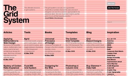
The Grid: Love it or Leave it.
Mobile-friendly designers will typically start designing a website by how it looks like on mobile devices, then expanding and scaling the design outwardly from there. The idea is that everyone will be looking at essentially the same website, and there is no inferior way to browse.
Mobile-friendly developers mostly code websites as a giant grid to complement this aforementioned approach to design. For instance, each item on a typical WordPress site: posts, sliders, headlines, forms, and etc. are placed inside various squares of a grid. This makes it very easy to scale websites. As the screen becomes larger and smaller, you can shift the grid around so that everything still fits, but the code itself stays the same underneath.
Most developers who are giving an old site true responsiveness are essentially coding a new site from scratch but still wrapping it up in your design that looked good back in 2010. It makes more sense to just go back to the drawing board and start fresh.
By now I can feel your frustration coming through. You’re likely thinking, “This is all well-and-good, but I still can’t afford the time/money to invest in a brand new website right now.” You might even be thinking that there’s nothing wrong with your site as it is, except for Google’s stupid new rule.
If you’re a WordPress user, there are a few plugins out there that can take your pages, posts, etc. and wrap it in a separate mobile site. Notably WPTouch—with a couple free themes—and the mobile theme feature in Jetpack. Desktop users will still see your same-old site, and mobile users will be served up something different.
Keep in mind, however, that your mobile users will be looking at an inferior version of your site that might not work very well. Eventually, you’ll have to move on.
It’s not as intimidating as it seems, we promise. In fact, you could do it yourself over a long weekend. That’s what our seminar can show you.
The above video shows how to make JPG Thumbnails of PDFs posted to your WordPress website the old fashioned manual way.
We’ve got a handy post about a plugin that makes it a cinch- https://websitetology.com/word-press-plugins/new-easy-way-to-make-thumbnails-for-pdfs/
There are many reasons why you would want to do this. First and foremost, uploading PDFs using the basic WordPress uploader just provides a link to the document- without a way for your user to see what the PDF looks like.
The reason you are using PDF’s instead of a JPG is because PDFs, if created properly, are search engine friendly and handicap accessible. To make a PDF properly, it’s not made from a scan- it’s made from an document- so that you can highlight and copy text from the PDF. If you are making a PDF from a scan, make sure you use the “recognize text” function to perform Optical Character Recognition on your scan. It won’t be perfect, but it will be close.
JPG’ss are also not search engine friendly, whereas PDF’s are.
Creating a JPG preview of your PDF is easy and will give your website’s users a better experience.