Websitetology site makeover
There is an old saying about the cobblers kids having the worst shoes. We have felt kind of guilty about our site and finally got around to giving it a facelift.
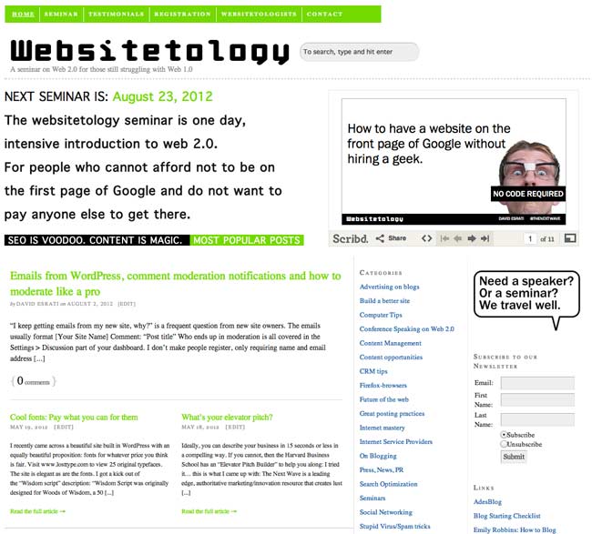
We’re still working on some details, including our CRM integration and a few other cool tricks, but here is the before:
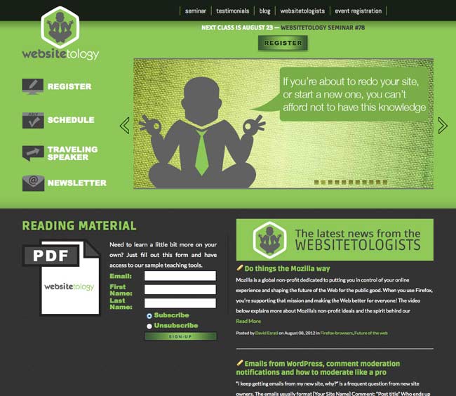
The new site, incorporates the new identity, a much more focused front page, with calls to action. We’re still working on adding functionality. Note, the content hasn’t changed- just the way it’s displayed- this is the beauty of WordPress:
We’d love to hear what you think of the new design in the comments.


Like it! It certainly has a richer feel to to it and the logo is interesting. Good luck with getting all the functionalities worked out. See you soon!