


Google pays its respects to Websitetology 2015.
In one of our most recent email newsletters, we pointed readers to Google’s Mobile-Friendly Test so that people could check to make sure their sites weren’t being penalized. This link was far and away the hottest item in the email, with over 400% more clicks than any other link in the newsletter.
In spite of Google’s attempts at emphasizing the importance of mobile-friendly design, and later on their tough-love warnings that your sites will be punished after April 21st, the message seems clear to us: people, businesses, and their websites are being left behind and many are unsure what to do to catch up.
Some may breathe a sigh of relief upon receiving a passing mark from the test, but what if you’re left with a big, fat F?
Over at our agency, The Next Wave, we commonly receive requests to “add responsiveness to our existing site.” We understand that this kind of request comes from a good place: folks who are looking for an inexpensive and painless way into the mobile-friendly realm by “adding on” the mobile functionality.
The problem is that this is actually pretty difficult, in some cases impossible, to achieve from a designer and developer’s perspective.
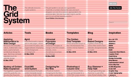
The Grid: Love it or Leave it.
Mobile-friendly designers will typically start designing a website by how it looks like on mobile devices, then expanding and scaling the design outwardly from there. The idea is that everyone will be looking at essentially the same website, and there is no inferior way to browse.
Mobile-friendly developers mostly code websites as a giant grid to complement this aforementioned approach to design. For instance, each item on a typical WordPress site: posts, sliders, headlines, forms, and etc. are placed inside various squares of a grid. This makes it very easy to scale websites. As the screen becomes larger and smaller, you can shift the grid around so that everything still fits, but the code itself stays the same underneath.
Most developers who are giving an old site true responsiveness are essentially coding a new site from scratch but still wrapping it up in your design that looked good back in 2010. It makes more sense to just go back to the drawing board and start fresh.
By now I can feel your frustration coming through. You’re likely thinking, “This is all well-and-good, but I still can’t afford the time/money to invest in a brand new website right now.” You might even be thinking that there’s nothing wrong with your site as it is, except for Google’s stupid new rule.
If you’re a WordPress user, there are a few plugins out there that can take your pages, posts, etc. and wrap it in a separate mobile site. Notably WPTouch—with a couple free themes—and the mobile theme feature in Jetpack. Desktop users will still see your same-old site, and mobile users will be served up something different.
Keep in mind, however, that your mobile users will be looking at an inferior version of your site that might not work very well. Eventually, you’ll have to move on.
It’s not as intimidating as it seems, we promise. In fact, you could do it yourself over a long weekend. That’s what our seminar can show you.
It’s nice to see the Dayton Business Journal using our client, Coco’s Bistro as an example of how to do a website that’s also perfectly mobile aware, instead of having to build a second site or a mobile application.

Coco's number 1 Google listing
Keeping one website up to date is enough work for a small business- to have to maintain two versions- or even a mobile application, adds a lot of costs with limited payback. We built www.228coco.com entirely in WordPress and it’s totally mobile aware and has an incredible Google listing.
The business journal gives examples of companies paying thousands of dollars for mobile apps- where they really need to be investing in content and maintaining social media connections. Here’s the highlights of the article:
When Karen Gagnet gave her advertising agency the thumbs up to develop a mobile phone site 18 months ago, many of her potential customers weren’t using smartphones to find a place to eat. At least not yet.
These days, the co-owner of Coco’s Bistro in Dayton insists the gadgets are driving new traffic to her restaurant while strengthening the bond with regulars, who make a growing number of reservations and other requests via smartphone.
“It wasn’t something my diners expected from me two years ago,†Gagnet said. “Now, it becomes more important for my business every day.â€
For Coco’s and other Dayton-area companies, using mobile phone sites and other similar technology to grab consumers is on the upswing and industry observers expect the trend to continue as more people buy smartphones, which combine mobile calling and personal computing capabilities. That translates into a growing number of diners, for example, who are using smartphones to hunt for restaurant reviews and menus.
“It’s a necessity now to compete,†said David Esrati, chief creative officer of Dayton-based advertising agency The Next Wave, which developed Coco’s mobile phone site.
The worldwide mobile phone market grew 22 percent in the first quarter of 2010, fueled mostly by increased demand for smartphones, according to the Framingham, Mass.-based IDC’s Worldwide Mobile Phone Tracker. The tech and communication research firm reports that vendors shipped nearly 295 million mobile phones in the first quarter of 2010, compared with 242 million units in the same period last year.
IDC officials said smartphones, which allow consumers and business people to trade wireless e-mails and surf the Web, have become increasingly popular as a wider and more powerful array of devices have become available.
Businesses that have a traditional Web site built to today’s industry standards should be able to adapt it to mobile phone viewing for only several hundred dollars, Esrati said. The cost includes the addition of a browser detector and an extra style sheet, which is a formatting tool.
On the flip side, businesses with Web sites that aren’t built to industry standards, or are made with slick features such as Flash, can expect to pay about double the original site development costs to create a separate mobile phone site.
“Anything that’s dependent on a screen size to work doesn’t translate well to mobile,†Esrati said.
While only a small segment of the smartphone market, iPhones continue to grow in popularity as well, especially among affluent demographics. And iPhone users are flocking to software applications, also known as apps, racking up 4 billion downloads, including 3 million within the past year.
Brad Churby, owner of Kettering-based Web development and network administration company OmniSpear Inc., has been pushing clients to adapt their sites for mobile phones. But, in recent months the five-person company also moved into the mobile app scene as it got a growing number of calls from customers wanting the service.
The big difference between launching a mobile phone site and an app is the cost.
While mobile sites can be done for as little as a few hundred dollars, Churby said developing an iPhone app, or an app for Blackberry or Android platforms, can run $10,000 or more, depending on the complexity. Most of the demand at OmniSpear so far has been for iPhone apps. The pricing for apps is relatively high now because tools to do the job aren’t very advanced, meaning the job is labor intensive, he said.
Hothead Burritos was able to get an iPhone app running for under $1,000 said co-owner Ray Wiley. The company is currently working on a mobile-friendly Web page and looking into developing apps for other platforms.
Wiley said having an iPhone app has added credibility to his brand, which he is franchising.
“I think customers like the app for multiple reasons; (it’s) easy to find a location, occasionally we offer a discount or deal, and I think people see us as being more evolved as a chain in having an app,†he said….
The downside to apps: reaching most of the market requires developing apps for Blackberry and Android as well.
“That gets expensive,†Esrati said. “(iPhone) is a narrow group of users still.â€
If you’re still not sure about if you need a web app or a mobile site, you can read this post: Is that your website or an app on your mobile phone?